JP Morgan
Annotation tool (ML)
Designing an enterprise annotation platform to simplify data labeling and improve workflow efficiency.
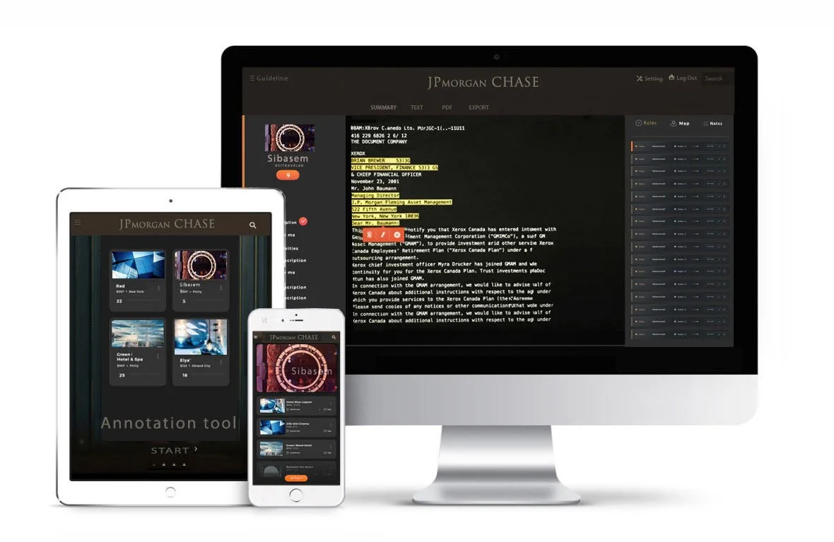
At JPMorgan, I led the end-to-end UX and product design of an enterprise annotation tool that streamlined data labeling workflows. The platform enabled users to efficiently search, annotate, label, and tag large datasets using Natural Language Processing (NLP), reducing manual effort and improving annotation consistency.
-
![]()
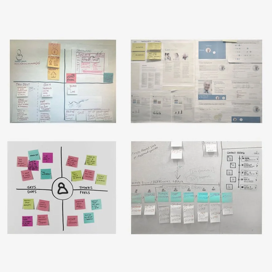
Contextual inquiry user research, Persona, User journey, empathy map
-
![]()
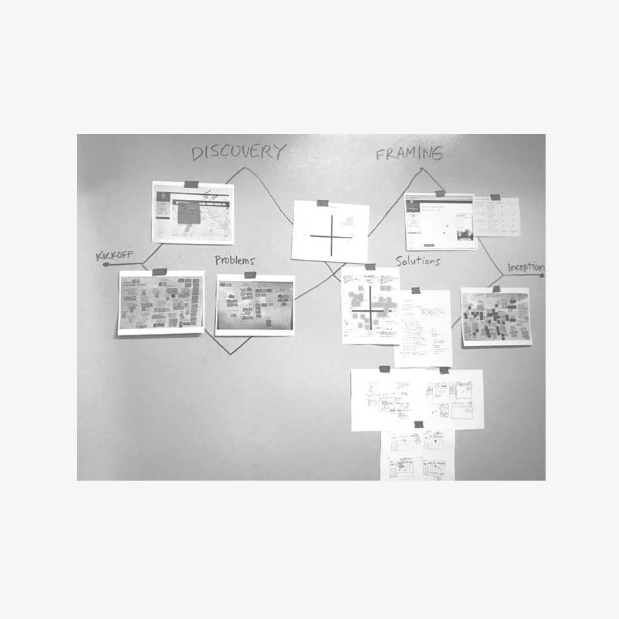
Discovery, Journey mapping
-
![]()
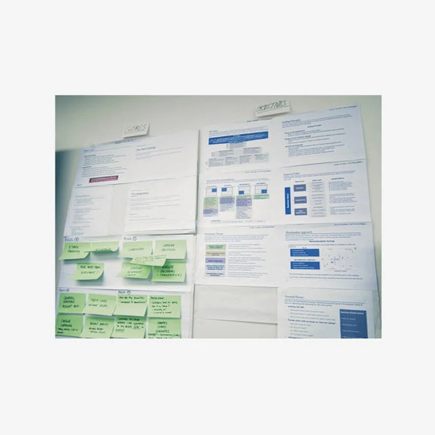
Define problem/solution
-
![]()
Sketches
-
![]()
Wireframe
-
![]()
Wireframe
-
![]()
User flow
-
![]()
Specification
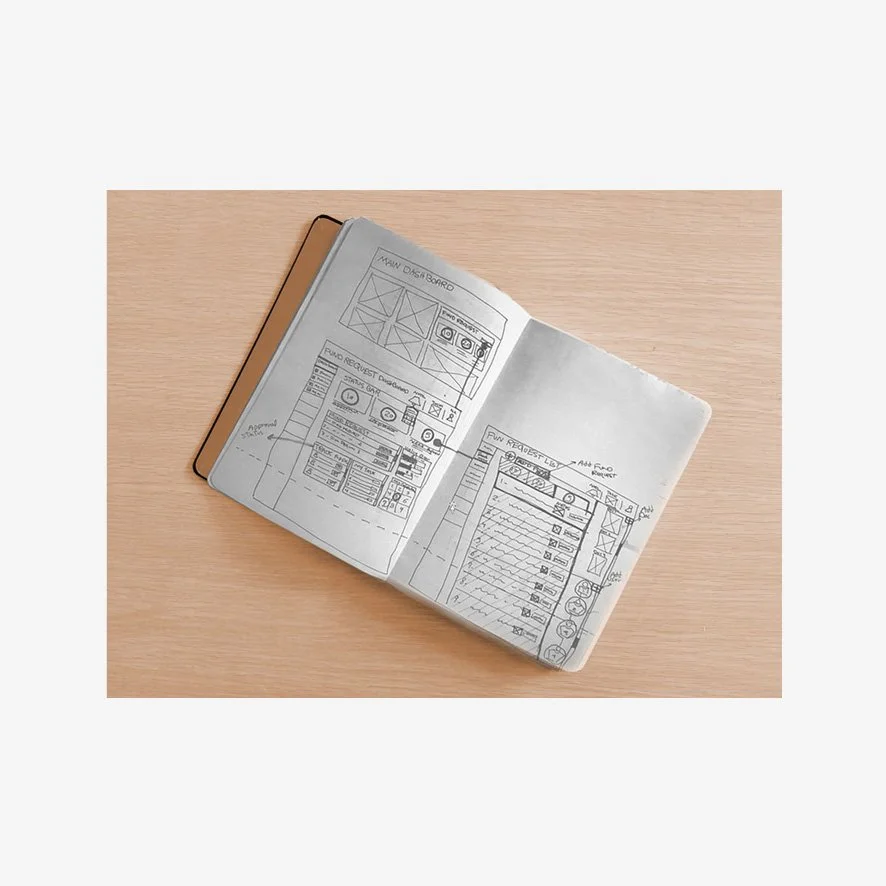
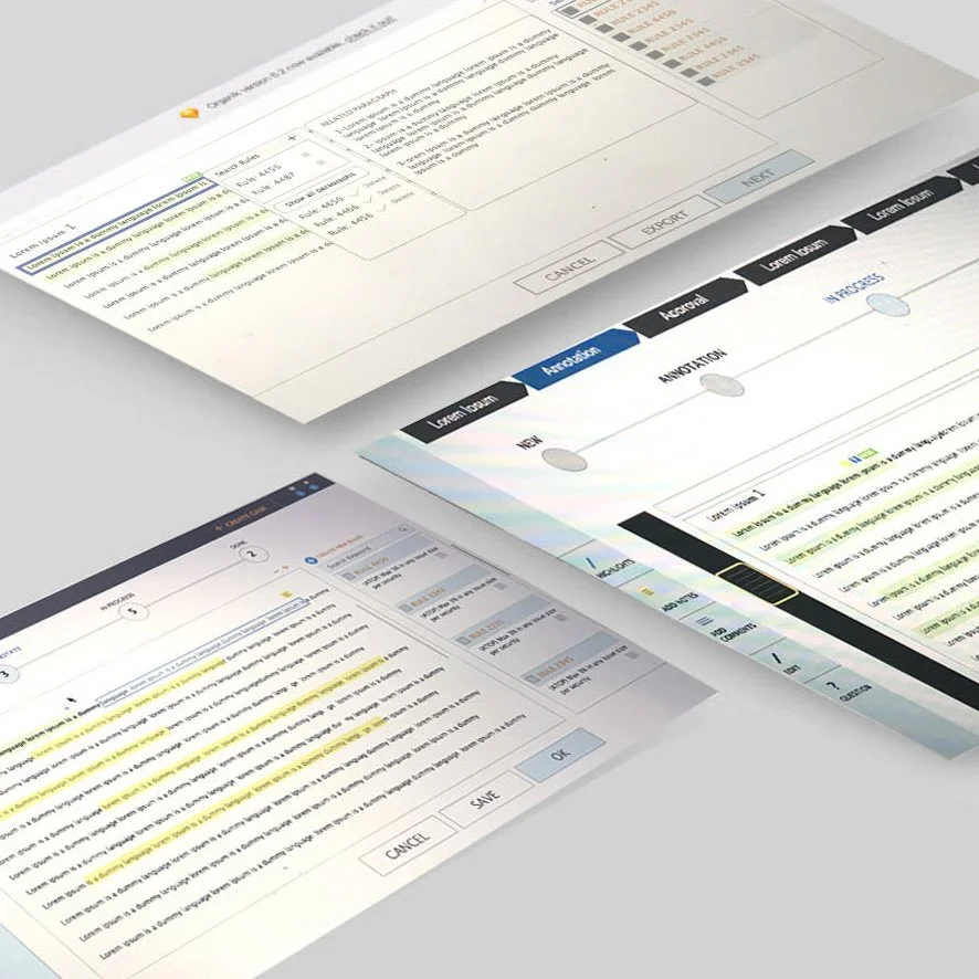
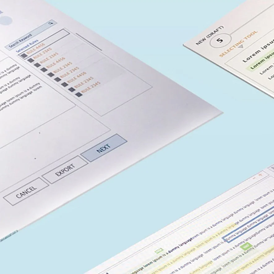
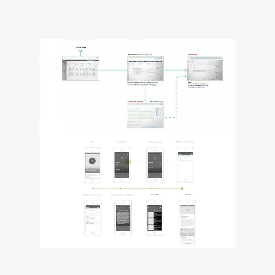
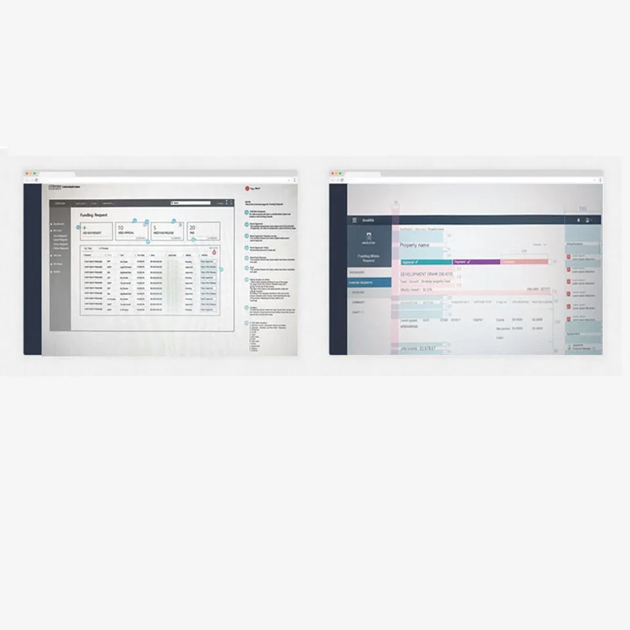
Challenge
Teams spent significant time manually reviewing and labeling large volumes of data, making the process repetitive, time-consuming, and difficult to scale.
Users frequently struggled with questions like:
How can we quickly find the right data?
How do we keep labeling consistent across teams?
How can we reduce repetitive manual work?
How can we prepare high-quality datasets more efficiently?
The existing workflow required multiple manual steps, slowing productivity and increasing the risk of inconsistent annotations.
Impact
Reduced repetitive manual work by simplifying annotation workflows.
Improved consistency and quality of labeled data through standardized interactions.
Accelerated data preparation by enabling users to efficiently search, label, and organize large datasets.
Created a scalable workflow that improved productivity and supported future data and machine learning initiatives.
Solution
I designed an intuitive annotation platform that simplified the entire labeling workflow.
The experience enabled users to:
Search large datasets using Natural Language Processing (NLP)
Annotate, label, and tag data efficiently
Organize information through intuitive workflows
Review and update annotations quickly
Maintain consistency through standardized labeling patterns
The interface reduced unnecessary complexity, allowing users to spend less time managing data and more time producing high-quality annotations.
Asset Comparison Map
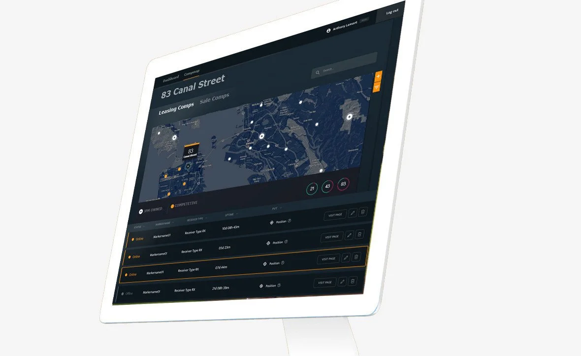
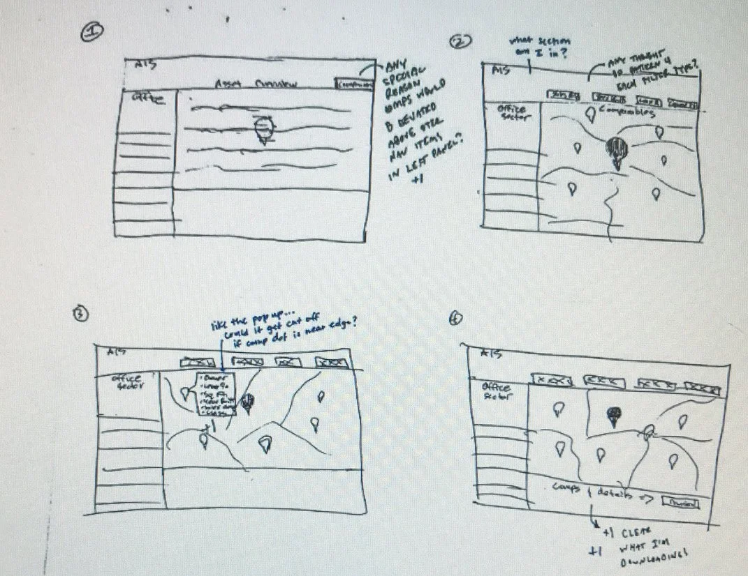
At JPMorgan Asset Management, I led the end-to-end UX and product design of the Asset Comparison Map, an internal analytics platform that helped Asset managers visualize, compare, and analyze investment opportunities across geographic locations.
The tool transformed large volumes of financial and property data into an interactive map, allowing users to compare assets, evaluate market conditions, and make more informed investment decisions without switching between multiple spreadsheets and reporting tools.
-
![]()
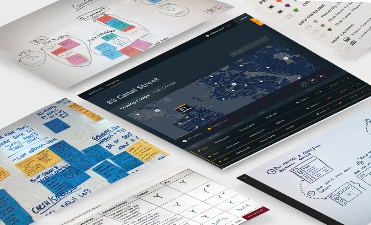
Process
-
![]()
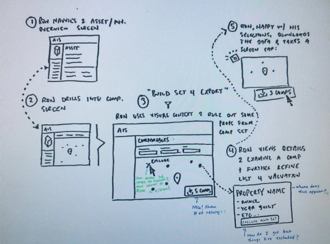
Sketches
-
![]()
Goals
-
![]()
User journey
-
![]()
Map
-
![]()
User feedback
-
![]()
Sketches
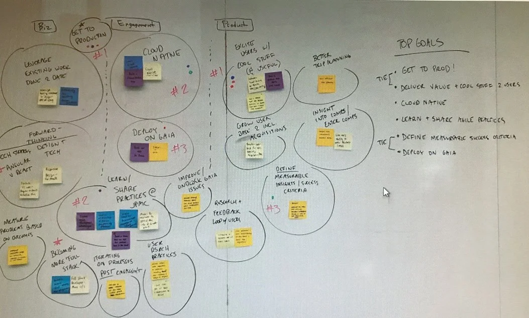
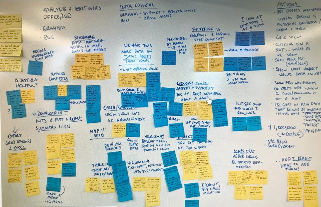
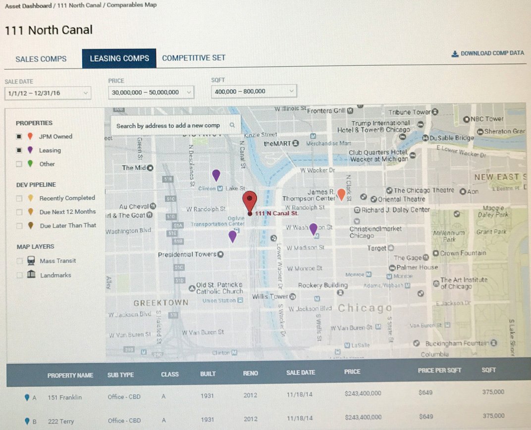
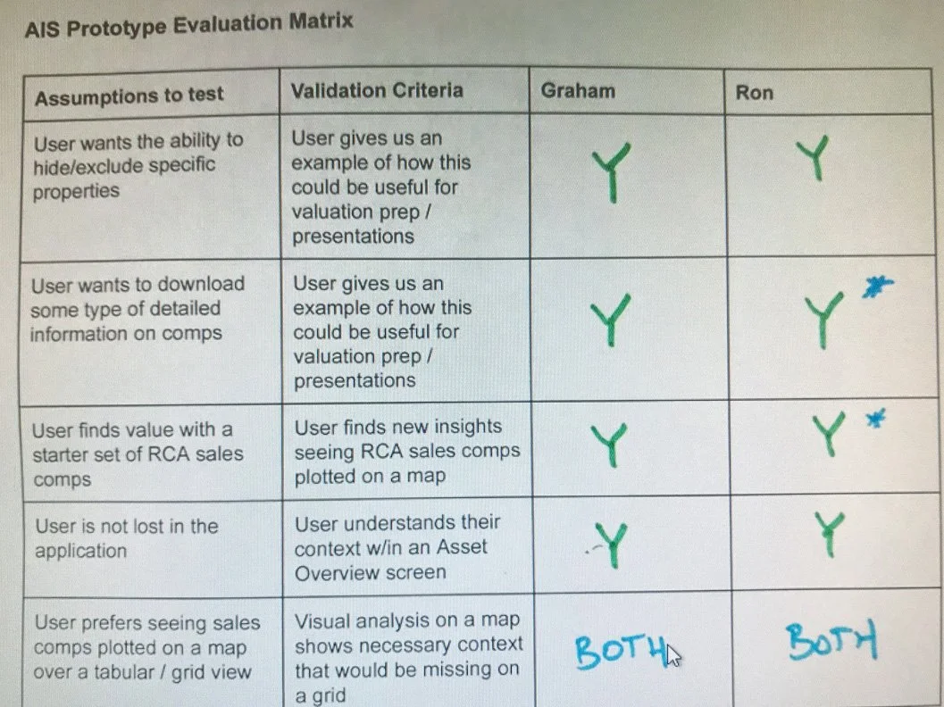
Challenge
Asset managers relied on multiple systems, spreadsheets, and reports to evaluate investment opportunities.
They needed answers to questions like:
Which assets perform best in a specific region?
How do multiple properties compare side by side?
Where are investment opportunities concentrated?
Which markets are increasing or decreasing in value?
How can I compare dozens of assets without opening multiple reports?
The existing workflow was slow, fragmented, and made geographic comparisons difficult.
Solution
I designed an interactive comparison map that combined location intelligence with financial analytics.
The platform enabled users to:
Visualize assets directly on an interactive map
Compare multiple properties side by side
Filter investments by location, portfolio, and asset type
View detailed asset information without leaving the map
Quickly identify trends and investment opportunities
The experience simplified complex financial data into an intuitive visual interface that supported faster decision-making.
Design System Framework
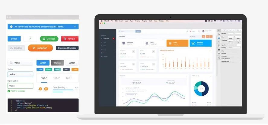
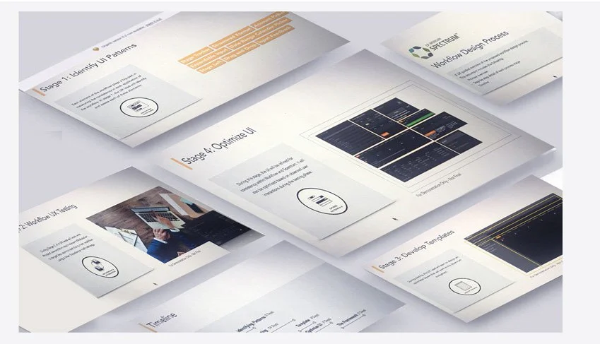
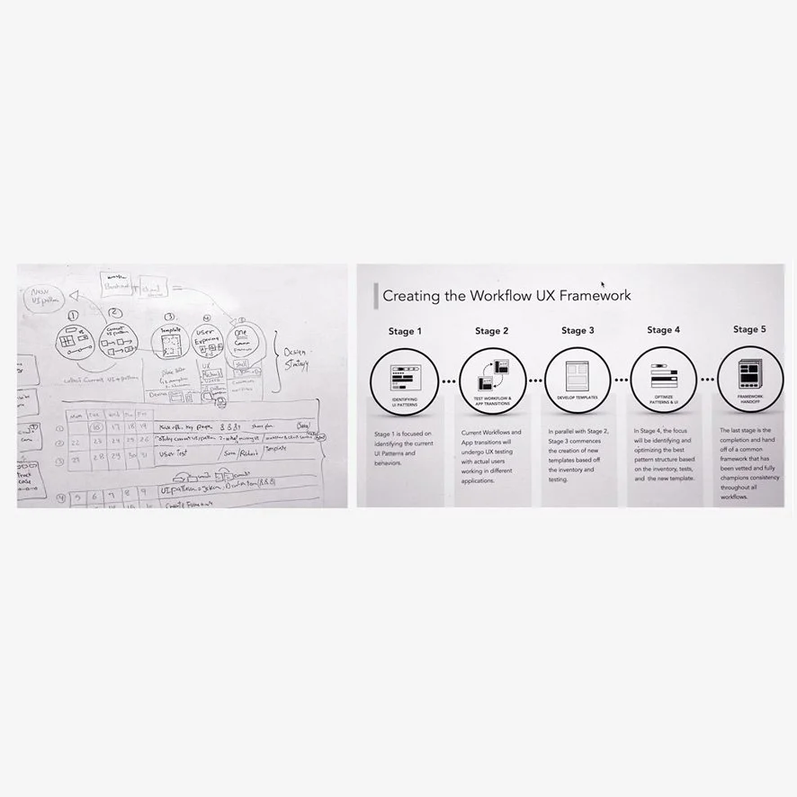
Created a scalable design system and step-by-step workflow for consistent internal business tools at JPMorgan.
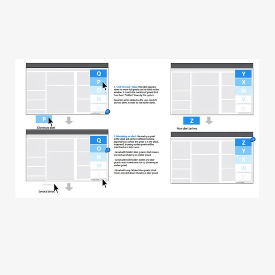
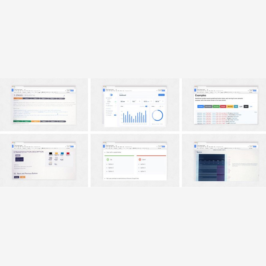
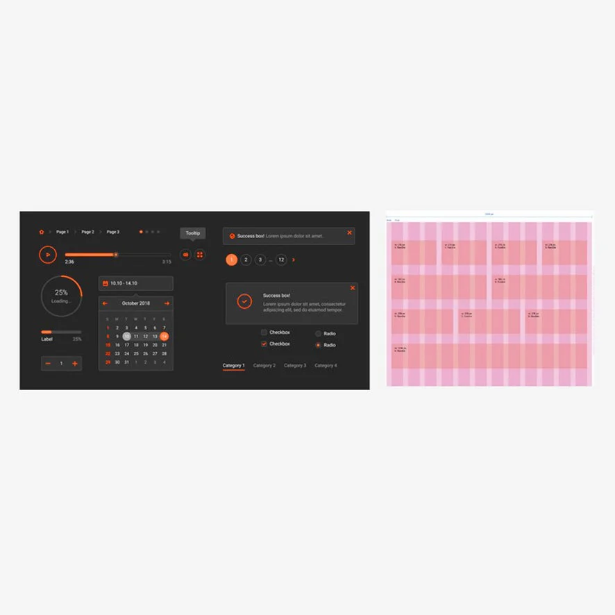
At JPMorgan, I helped design a shared design system framework for internal business applications. The goal was to replace inconsistent interfaces and disconnected design patterns with a reusable system that enabled teams to design and build products more efficiently.
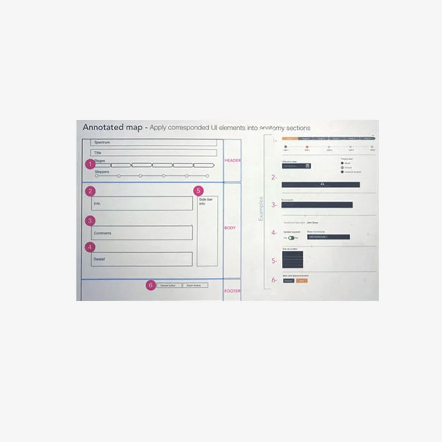
The framework brought together UI components, interaction patterns, accessibility guidance, documentation, and implementation standards. It created a common foundation for designers, product teams, and engineers working across multiple internal tools.
-
![]()
Design stages
-
![]()
Pattern library
-
![]()
Interactive design
-
![]()
Design pattern
-
![]()
Design
-
![]()
Workflow framework
-
![]()
Components
-
![]()
Template
Challenge
Internal business tools had been created by different teams at different times, resulting in inconsistent experiences.
The same interface elements were often designed and implemented differently across products. This created several problems:
Users had to relearn familiar actions from one tool to another.
Designers repeatedly recreated common components.
Engineers maintained duplicate patterns and code.
Accessibility and interaction standards were applied inconsistently.
Product teams had no shared reference for how interfaces should look or behave.
The central question became: How could we create one flexible system that supported different business needs while still delivering a consistent user experience?
Solution
I helped create a scalable design-system framework that connected design principles, reusable components, interaction guidance, and implementation documentation.
The system included:
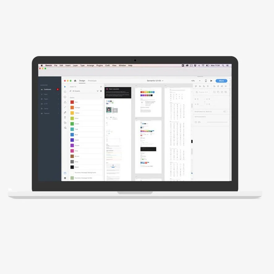
A shared UI component library
Standardized colors, typography, spacing, and layout rules
Reusable forms, tables, navigation, charts, filters, and notifications
Clear component states and behaviors
Accessible interaction patterns
Templates for common internal workflows
Documentation connecting design components to coded implementations